mirror of
https://github.com/paperclipai/paperclip.git
synced 2026-11-20 18:26:40 +01:00
 DottaandClaude Opus 5.5
d807887534
## Thinking Path > - Paperclip is the open source app people use to manage AI agents for work. > - Task status is the main signal on every task surface: sidebar rows, the task header, the status menu, lists, the inbox, pills and chat cards. > - One task state rendered different status icons in different views. A blocked task that waits on an active sub-task showed the blue "in queue" glyph in the task header. The status menu, the chat chip and the sidebar rows showed the red "Blocked" glyph for the same task. > - The cause: each view passed its own subset of the presentation fields to `StatusIcon`. Many views dropped `blockerAttention` and some dropped `externalConversationState`. The status menu rendered its current row from the bare status. The summaries API did not return `blockerAttention`, so the recent-task sidebar could not know the state. > - This pull request puts the state-to-glyph/label mapping in one resolver and makes every task view pass all of its fields. > - The benefit is that the same state uses the same icon and label everywhere. ## Linked Issues or Issue Description No public issue. Found in a hands-on onboarding test on a staging cloud workspace. **What happened?** The sidebar and the task pane/status menu showed different status icons for the same state. On the test task (blocked, waiting on an active sub-task), the task header and the status button showed the blue "in queue" glyph. The selected "Blocked" row in the status menu showed the red blocked glyph. The coordinator sidebar "Recents" and project rows also showed the red blocked glyph, and the chat "Subtask created" chip showed a red "Blocked" chip. **Expected behavior** The same underlying state uses the same icon and label everywhere. **Steps to reproduce** 1. Create a task with a sub-task. Block the parent on the sub-task, and let the sub-task's agent run (the parent is "blocked, covered"). 2. Open the parent task. The header shows the blue "in queue" glyph. 3. Open the status menu. The current "Blocked" row shows the red glyph. 4. With the coordinator sidebar on, look at the task in Recents or in its expanded project. It shows the red glyph. **Paperclip version or commit** `master` at03eb49053f. ## What Changed - Add `ui/src/lib/task-status-presentation.ts`. `resolveTaskStatusPresentation()` is the one mapping from `status`, `displayStatus`, `externalConversationState` and `blockerAttention` to glyph, label and accessible copy. `taskStatusIconProps()` picks all four fields from a task record. - `StatusIcon` and `IssueStatusBadge` use the resolver. The status menu draws the current row with the trigger's presentation (in queue, idle, monitoring). - `IssueStatusBadge` now accepts `blockerAttention`. `taskStatusVar.in_queue` maps to the existing in-progress chip hue, the same as the existing `--status-task-icon-in_queue` icon token. - Task call sites spread `taskStatusIconProps(task)`: coordinator sidebar recents and project rows, classic recent tasks, lists, rows, columns, inbox, blocked inbox, my issues, dashboard, properties, relation pills, search, sibling navigation, chat chips, case summaries, status cards and user profile. Step/check statuses in protocol cards stay unchanged because they are not task statuses. - `GET /api/companies/:companyId/issues/summaries` returns `blockerAttention` for blocked rows (at most five IDs, through the existing `listBlockerAttention` service). `IssueSummary` gets the optional field. - Recent-task snapshots store and refresh `blockerAttention`. Sidebar project rows request the `rows` projection, which includes blocker state (the `index` projection skips it). - Storybook: the Foundations/Status Language story gets a "Same state, every view" section. ## Verification Red on `master` (tests written first, then run against the unchanged code): ``` cd ui && npx vitest run src/components/StatusIcon.picker.test.tsx src/components/CoordinatorSidebar.test.tsx src/lib/recent-tasks.test.ts × keeps the covered-blocker state so the sidebar shows the same queued glyph as the task pane (BUG-07) × marks the current row with the same glyph as the trigger for a covered-blocked task × marks the current row with the same glyph as the trigger for a waiting review and a monitored task × shows a covered-blocked recent task with the same queued glyph and label as the task pane × shows project tasks with their full status presentation FAIL StatusIcon.picker.test.tsx > ... covered-blocked task AssertionError: expected 'var(--status-task-icon-blocked)' to be 'var(--status-task-icon-in_queue)' FAIL StatusIcon.picker.test.tsx > ... waiting review and a monitored task AssertionError: expected 'var(--status-task-icon-in_review)' to be 'var(--status-task-icon-backlog)' FAIL CoordinatorSidebar.test.tsx > ... covered-blocked recent task ... AssertionError: expected 'var(--status-task-icon-blocked)' to be 'var(--status-task-icon-in_queue)' FAIL CoordinatorSidebar.test.tsx > ... project tasks with their full status presentation AssertionError: expected "vi.fn()" to be called with arguments: [ 'company', ObjectContaining{…} ] FAIL recent-tasks.test.ts > ... keeps the covered-blocker state ... AssertionError: expected undefined to deeply equal { state: 'covered', …(7) } Tests 5 failed | 32 passed (37) cd server && npx vitest run src/__tests__/issue-summaries-routes.test.ts × projects the covered-blocker state so every task view picks the same queued glyph (BUG-07) AssertionError: expected undefined to match object { state: 'covered', …(2) } Tests 1 failed | 14 passed (15) ``` Green with this change (same commands): ``` Test Files 3 passed (3) Tests 37 passed (37) Test Files 1 passed (1) # server summaries route Tests 15 passed (15) ``` Neighbouring and broader checks: - `StatusIcon`, `StatusBadge`, `StatusGlyph`, picker, sidebar and recent-task suites: 73/73 pass. - Full UI Vitest run: 11106 pass, 1 skipped. Three `IssuesList.test.tsx` tests timed out at 5 s under full-suite load. The same file passes 73/73 when run alone. - `tsc --noEmit` for `ui` and `server`: no errors in changed files. Remaining errors are pre-existing (unbuilt `@paperclipai/paperclip-runner`, generated Storybook catalog). - `pnpm check:token-gates`: all gates clean. Screenshots. The staging task before the fix: the status button is blue, the current "Blocked" row in the menu is red. | Staging task (before) | Staging status menu (before) | | --- | --- | | 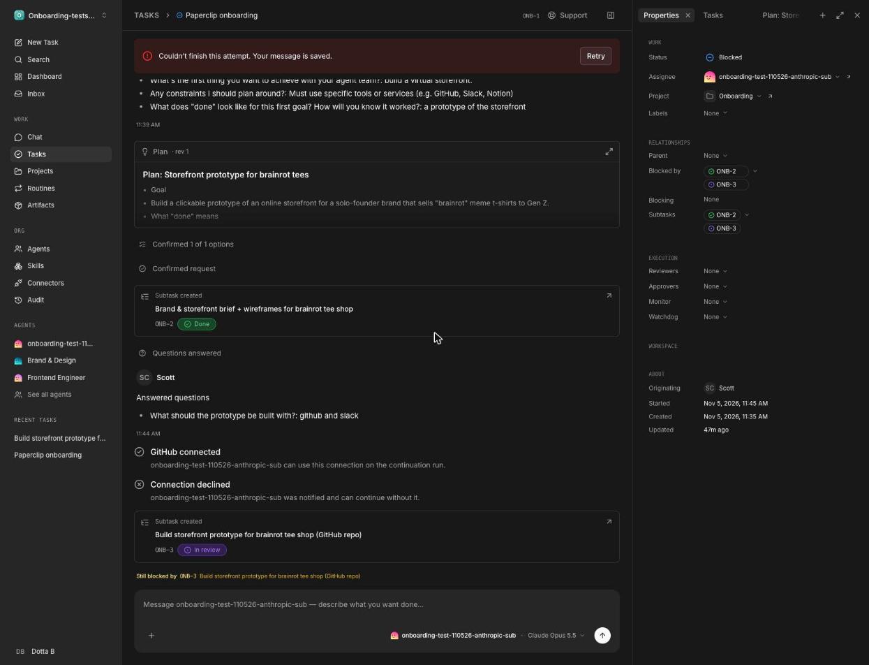 | 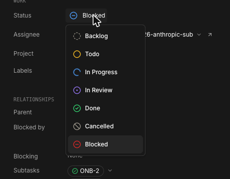 | Storybook "Same state, every view" (Foundations/Status Language). Before uses the `master` `StatusIcon`/`StatusBadge`; after uses this branch. | Before (master) | After (this PR) | | --- | --- | | 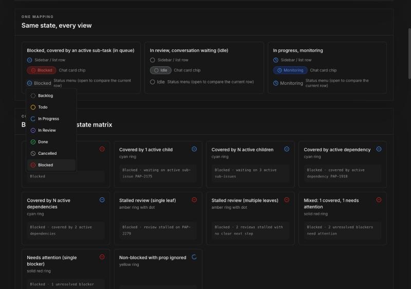 | 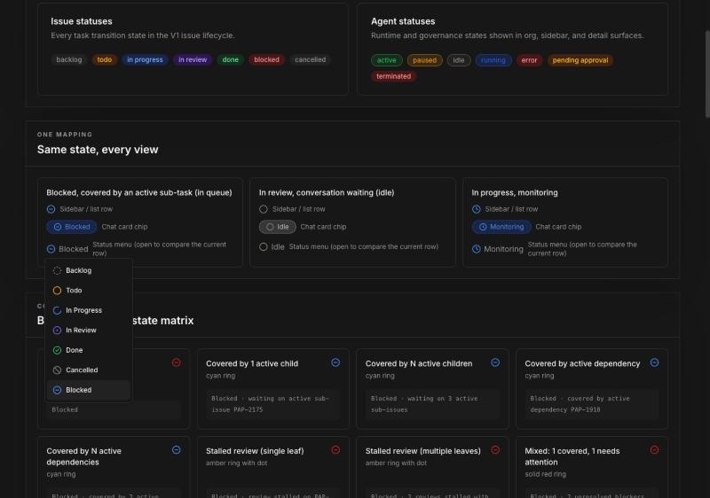 | Before: the row glyph is blue, but the chip and the current menu row are red. After: the row glyph, the chip and the current menu row are all the blue "in queue" glyph. Review follow-up (commits1d3a1a0a9e,d5c798ec53): blocker state on summaries, search and case responses is glyph-only (state, reason, counts). Blocker titles and IDs are never returned; a sampled identifier stays only when the actor can read that blocker. Producer-level tests failed before the follow-up and pass after it (\`task-created-items.test.tsx\`, \`CoordinatorTaskCommitment.test.tsx\`, \`company-search-service.test.ts\`, \`cases-routes.test.ts\`, private-blocker case in \`issue-summaries-routes.test.ts\`). Before merge, the branch was test-merged locally with current \`master\`: typecheck clean, 1095 UI and 80 server tests in the affected suites pass. ## Risks - Low risk. Presentation only. Status mutations still use the canonical `status`. - The summaries endpoint now runs the blocker-attention query for blocked rows. The endpoint accepts at most five IDs and runs the query only when a row is blocked. - Sidebar project rows use the `rows` projection instead of `index`. This adds the blocker and review attention reads for at most 12 rows, and only when a person expands a project. - `IssueStatusBadge` shows the blue "in queue" chip for covered-blocked tasks where callers pass `blockerAttention`. The label stays "Blocked" and the full reason is in the tooltip. ## Model Used - Claude Opus 5.5 (`claude-opus-5-5`, Anthropic), through Claude Code with tool use (shell, file edits, browser). Default context window. ## Checklist - [x] I have included a thinking path that traces from project context to this change - [x] I have specified the model used (with version and capability details) - [x] I have checked ROADMAP.md and confirmed this PR does not duplicate planned core work - [x] I have searched GitHub for duplicate or related PRs and linked them above - [x] I have either (a) linked existing issues with `Fixes: #` / `Closes #` / `Refs #` OR (b) described the issue in-PR following the relevant issue template - [x] I have not referenced internal/instance-local Paperclip issues or links (only public GitHub `#NNN` / `github.com/paperclipai/paperclip` URLs) - [x] My branch name describes the change (e.g. `docs/...`, `fix/...`) and contains no internal Paperclip ticket id or instance-derived details - [x] I have run tests locally and they pass - [x] I have added or updated tests where applicable - [x] I have updated relevant documentation to reflect my changes - [x] I have considered and documented any risks above - [x] All Paperclip CI gates are green - [x] Greptile is 5/5 with no open P2s, recommendations, or follow-ups - [x] I will address all Greptile and reviewer comments before requesting merge 🤖 Generated with [Claude Code](https://claude.com/claude-code) --------- Co-authored-by: Claude Opus 5.5 <noreply@anthropic.com>




405 lines
19 KiB
TypeScript
405 lines
19 KiB
TypeScript
/**
|
||
* Canonical status & priority color definitions.
|
||
*
|
||
* Every component that renders a status indicator (StatusIcon, StatusBadge,
|
||
* agent status dots, etc.) should import from here so colors stay consistent.
|
||
*/
|
||
|
||
// ---------------------------------------------------------------------------
|
||
// Issue status colors
|
||
// ---------------------------------------------------------------------------
|
||
|
||
// PAP-75 brand mapping ("blue = liveness"): todo → amber (queued), in_progress
|
||
// → blue (live). See `issueStatusColor` below for the canonical chip palette.
|
||
//
|
||
// The brand mapping is the default status palette. Chat-specific gating stays
|
||
// isolated to the Conference Room route/nav/API and does not control task
|
||
// status presentation.
|
||
|
||
/** StatusIcon circle: text + border classes */
|
||
export const issueStatusIcon: Record<string, string> = {
|
||
backlog: "text-muted-foreground border-muted-foreground",
|
||
todo: "text-amber-600 border-amber-600 dark:text-amber-400 dark:border-amber-400",
|
||
in_progress: "text-blue-600 border-blue-600 dark:text-blue-400 dark:border-blue-400",
|
||
in_review: "text-violet-600 border-violet-600 dark:text-violet-400 dark:border-violet-400",
|
||
done: "text-green-600 border-green-600 dark:text-green-400 dark:border-green-400",
|
||
cancelled: "text-neutral-500 border-neutral-500",
|
||
blocked: "text-red-600 border-red-600 dark:text-red-400 dark:border-red-400",
|
||
};
|
||
|
||
export const issueStatusIconDefault = "text-muted-foreground border-muted-foreground";
|
||
|
||
/** Text-only color for issue statuses (dropdowns, labels) */
|
||
export const issueStatusText: Record<string, string> = {
|
||
backlog: "text-muted-foreground",
|
||
todo: "text-amber-600 dark:text-amber-400",
|
||
in_progress: "text-blue-600 dark:text-blue-400",
|
||
in_review: "text-violet-600 dark:text-violet-400",
|
||
done: "text-green-600 dark:text-green-400",
|
||
cancelled: "text-neutral-500",
|
||
blocked: "text-red-600 dark:text-red-400",
|
||
};
|
||
|
||
export const issueStatusTextDefault = "text-muted-foreground";
|
||
|
||
// ---------------------------------------------------------------------------
|
||
// Brand `.task-chip` status palette (PAP-75 / status-reference.html)
|
||
//
|
||
// Colour-named, 1px border, light + dark — values straight from paperclip.ing
|
||
// `brand.css`. Shared by the agents section (PAP-80) and the All Projects page
|
||
// (PAP-91); PAP-99 brings it to issue/task status chips, adding `violet` for
|
||
// `in_review`.
|
||
// ---------------------------------------------------------------------------
|
||
|
||
export type BrandChipColor = "gray" | "blue" | "amber" | "green" | "violet" | "red";
|
||
|
||
export const brandChipBadge: Record<BrandChipColor, string> = {
|
||
gray: "bg-[#F5F3F0] text-[#52585D] border-[#A8AEB2] dark:bg-[#6e696024] dark:text-[#9A958A] dark:border-[#9e958a73]",
|
||
blue: "bg-[#DBEAFE] text-[#1D4ED8] border-[#2563EB] dark:bg-[#2563eb2e] dark:text-[#2563EB] dark:border-[#2563eb73]",
|
||
amber: "bg-[#FEF3C7] text-[#B45309] border-[#F59E0B] dark:bg-[#f59e0b24] dark:text-[#F59E0B] dark:border-[#f59e0b73]",
|
||
green: "bg-[#DCFCE7] text-[#188A3C] border-[#22C55E] dark:bg-[#22c55e1f] dark:text-[#22C55E] dark:border-[#22c55e73]",
|
||
violet: "bg-[#EDE9FE] text-[#5B21B6] border-[#7C3AED] dark:bg-[#7c3aed2e] dark:text-[#7C3AED] dark:border-[#7c3aed73]",
|
||
red: "bg-[#FEE2E2] text-[#991B1B] border-[#DC2626] dark:bg-[#dc26262e] dark:text-[#DC2626] dark:border-[#dc262673]",
|
||
};
|
||
|
||
// ---------------------------------------------------------------------------
|
||
// Badge colors — used by StatusBadge for all entity types
|
||
// ---------------------------------------------------------------------------
|
||
|
||
export const statusBadge: Record<string, string> = {
|
||
// Agent statuses
|
||
// Gallery feedback r3: agent chips route through the brand chip families
|
||
// (bordered .task-chip recipes) instead of ad-hoc tints. NOTE: `active` has
|
||
// no canonical agent status — user-ruled mapping to the brand GREEN family;
|
||
// `idle` is the gray family (was a yellow/amber tint); `error` rides the
|
||
// shared run-status red entry below.
|
||
active: `border ${brandChipBadge.green}`,
|
||
running: `border ${brandChipBadge.blue}`, // r1 made this blue; r3 routes through brandChipBadge.blue.
|
||
scheduled_retry: "bg-sky-100 text-sky-700 dark:bg-sky-900/50 dark:text-sky-300",
|
||
paused: `border ${brandChipBadge.amber}`,
|
||
idle: `border ${brandChipBadge.gray}`,
|
||
archived: "bg-muted text-muted-foreground",
|
||
|
||
// Goal statuses
|
||
planned: "bg-muted text-muted-foreground",
|
||
achieved: "bg-green-100 text-green-700 dark:bg-green-900/50 dark:text-green-300",
|
||
completed: "bg-green-100 text-green-700 dark:bg-green-900/50 dark:text-green-300",
|
||
|
||
// Run statuses
|
||
failed: "bg-red-100 text-red-700 dark:bg-red-900/50 dark:text-red-300",
|
||
timed_out: "bg-orange-100 text-orange-700 dark:bg-orange-900/50 dark:text-orange-300",
|
||
succeeded: "bg-green-100 text-green-700 dark:bg-green-900/50 dark:text-green-300",
|
||
ok: "bg-green-100 text-green-700 dark:bg-green-900/50 dark:text-green-300",
|
||
warning: "bg-amber-100 text-amber-700 dark:bg-amber-900/50 dark:text-amber-300",
|
||
error: "bg-red-100 text-red-700 dark:bg-red-900/50 dark:text-red-300",
|
||
info: "bg-sky-100 text-sky-700 dark:bg-sky-900/50 dark:text-sky-300",
|
||
terminated: "bg-red-100 text-red-700 dark:bg-red-900/50 dark:text-red-300",
|
||
pending: "bg-yellow-100 text-yellow-700 dark:bg-yellow-900/50 dark:text-yellow-300",
|
||
// Skill Studio test-run "queued" aligns with pending (yellow). PAP-12962 D6.
|
||
queued: "bg-yellow-100 text-yellow-700 dark:bg-yellow-900/50 dark:text-yellow-300",
|
||
|
||
// Approval statuses
|
||
pending_approval: "bg-amber-100 text-amber-700 dark:bg-amber-900/50 dark:text-amber-300",
|
||
revision_requested: "bg-amber-100 text-amber-700 dark:bg-amber-900/50 dark:text-amber-300",
|
||
approved: "bg-green-100 text-green-700 dark:bg-green-900/50 dark:text-green-300",
|
||
rejected: "bg-red-100 text-red-700 dark:bg-red-900/50 dark:text-red-300",
|
||
|
||
// Case statuses (PAP-12968 E3) — `draft` is the neutral pre-work state,
|
||
// rendered as a muted gray alias of `backlog`/`planned`. The other case
|
||
// statuses (in_progress/in_review/approved/done/cancelled) already map above.
|
||
draft: "bg-muted text-muted-foreground",
|
||
|
||
// Issue statuses — consistent hues with issueStatusIcon above (PAP-75 brand
|
||
// mapping: todo → amber, in_progress → blue "liveness").
|
||
backlog: "bg-muted text-muted-foreground",
|
||
todo: "bg-amber-100 text-amber-700 dark:bg-amber-900/50 dark:text-amber-300",
|
||
in_progress: "bg-blue-100 text-blue-700 dark:bg-blue-900/50 dark:text-blue-300",
|
||
in_review: "bg-violet-100 text-violet-700 dark:bg-violet-900/50 dark:text-violet-300",
|
||
blocked: "bg-red-100 text-red-700 dark:bg-red-900/50 dark:text-red-300",
|
||
done: "bg-green-100 text-green-700 dark:bg-green-900/50 dark:text-green-300",
|
||
cancelled: "bg-muted text-muted-foreground",
|
||
|
||
// Tool access — policy decisions, catalog, and runtime health (Tools & Access, PAP-10389)
|
||
allowed: "bg-green-100 text-green-700 dark:bg-green-900/50 dark:text-green-300",
|
||
denied: "bg-red-100 text-red-700 dark:bg-red-900/50 dark:text-red-300",
|
||
block: "bg-red-100 text-red-700 dark:bg-red-900/50 dark:text-red-300",
|
||
"require-approval": "bg-amber-100 text-amber-700 dark:bg-amber-900/50 dark:text-amber-300",
|
||
redacted: "bg-violet-100 text-violet-700 dark:bg-violet-900/50 dark:text-violet-300",
|
||
"rate-limit": "bg-orange-100 text-orange-700 dark:bg-orange-900/50 dark:text-orange-300",
|
||
deferred: "bg-sky-100 text-sky-700 dark:bg-sky-900/50 dark:text-sky-300",
|
||
hidden: "bg-muted text-muted-foreground",
|
||
quarantined: "bg-red-100 text-red-700 dark:bg-red-900/50 dark:text-red-300",
|
||
"runtime-error": "bg-red-100 text-red-700 dark:bg-red-900/50 dark:text-red-300",
|
||
healthy: "bg-green-100 text-green-700 dark:bg-green-900/50 dark:text-green-300",
|
||
degraded: "bg-amber-100 text-amber-700 dark:bg-amber-900/50 dark:text-amber-300",
|
||
unchecked: "bg-muted text-muted-foreground",
|
||
};
|
||
|
||
export const statusBadgeDefault = "bg-muted text-muted-foreground";
|
||
|
||
// ---------------------------------------------------------------------------
|
||
// Agent status — brand state system (PAP-75)
|
||
// ---------------------------------------------------------------------------
|
||
|
||
export type AgentBadgeColor = "gray" | "blue" | "amber" | "red";
|
||
|
||
/** Agent status → brand colour name. `active` aliases idle (never assigned). */
|
||
export const agentStatusColor: Record<string, AgentBadgeColor> = {
|
||
idle: "gray",
|
||
active: "gray",
|
||
running: "blue",
|
||
paused: "amber",
|
||
error: "red",
|
||
};
|
||
|
||
export const agentStatusColorDefault: AgentBadgeColor = "gray";
|
||
|
||
// Brand `.task-chip` styles per colour name live in `brandChipBadge` below —
|
||
// `AgentBadgeColor` is a subset of `BrandChipColor`, so agent badges index
|
||
// straight into it. (A byte-identical `agentStatusBadge` duplicate map was
|
||
// collapsed into `brandChipBadge` in the Run 2 review; DECISION-SHEET.md A1.)
|
||
|
||
/** Heartbeat-capsule fill (solid) per colour name. gray darkens in dark mode. */
|
||
export const agentStatusCapsule: Record<AgentBadgeColor, string> = {
|
||
gray: "bg-[#A8AEB2] dark:bg-[#6E6960]",
|
||
blue: "bg-[#2563EB]",
|
||
amber: "bg-[#F59E0B]",
|
||
red: "bg-[#DC2626]",
|
||
};
|
||
|
||
/** Per-status capsule motion (running pulses, error blinks). Honors reduced-motion. */
|
||
export const agentStatusMotion: Record<string, string> = {
|
||
running: "hb-pulse",
|
||
error: "hb-blink",
|
||
};
|
||
|
||
|
||
/**
|
||
* Brand blue TEXT pair (the text hues of `brandChipBadge.blue`) for non-chip
|
||
* "Running" labels — Gallery feedback round 1: running-state copy uses the
|
||
* canonical status blue, not cyan/teal. Kept here so components stay free of
|
||
* hex literals (token-gate scope).
|
||
*/
|
||
export const runningLabelText = "text-[#1D4ED8] dark:text-[#2563EB]";
|
||
|
||
/**
|
||
* Liveness-blue badge recipe — the shared "Live" / "Running" pill treatment
|
||
* (translucent blue fill + border + blue text). One source of truth so every
|
||
* live/running indicator reads as the same blue.
|
||
*/
|
||
export const liveBlueBadge = "bg-blue-500/10 border-blue-500/30 text-blue-600 dark:text-blue-400";
|
||
|
||
/**
|
||
* Issue/task status → brand colour name (PAP-75). `in_progress` is blue
|
||
* (liveness), `todo` amber (queued), `in_review` violet (awaiting review),
|
||
* `done` green, `blocked` red, `backlog`/`cancelled` gray (inert).
|
||
*/
|
||
|
||
// ---------------------------------------------------------------------------
|
||
// Inline banner tones (built-in agents provenance / paused notices)
|
||
//
|
||
// Softer, full-width banner surface derived from the same brand hue anchors as
|
||
// `brandChipBadge`. `info` carries provenance/informational context, `warning`
|
||
// carries paused/attention context, and `danger` carries failed actions. Consumed by
|
||
// `<InlineBanner>` so feature banners stay token-backed instead of hand-rolling
|
||
// per-instance `bg-yellow-*`/`bg-blue-*` recipes.
|
||
// ---------------------------------------------------------------------------
|
||
|
||
export type BannerTone = "info" | "warning" | "danger";
|
||
|
||
export const brandBanner: Record<BannerTone, string> = {
|
||
info: "border-[#2563EB]/40 bg-[#DBEAFE]/50 text-[#1D4ED8] dark:border-[#2563eb59] dark:bg-[#2563eb14] dark:text-[#93C5FD]",
|
||
warning: "border-[#F59E0B]/50 bg-[#FEF3C7]/60 text-[#B45309] dark:border-[#f59e0b59] dark:bg-[#f59e0b12] dark:text-[#F59E0B]",
|
||
// PAP-14031: aligned to the proven `failed`/`error` chip recipe (bg-red-100 /
|
||
// text-red-700 pair) so title + body both clear WCAG AA 4.5:1 in light and
|
||
// dark on either `--background` or `--card`. The prior `text-destructive` on
|
||
// `bg-destructive/10` measured ~3.7–4.3:1 — under AA for normal text. Border
|
||
// keeps the destructive hue for continuity with other danger surfaces.
|
||
danger: "border-destructive/40 bg-red-100 text-red-700 dark:bg-red-900/50 dark:text-red-300",
|
||
};
|
||
|
||
export const issueStatusColor: Record<string, BrandChipColor> = {
|
||
backlog: "gray",
|
||
todo: "amber",
|
||
in_progress: "blue",
|
||
in_review: "violet",
|
||
done: "green",
|
||
blocked: "red",
|
||
cancelled: "gray",
|
||
};
|
||
|
||
export const issueStatusColorDefault: BrandChipColor = "gray";
|
||
|
||
// ---------------------------------------------------------------------------
|
||
// Status → base-hue CSS variable
|
||
//
|
||
// Each status chip / icon sets a local `--sc` to the matching var below, and
|
||
// the `.status-chip` / `.status-fill` helpers (index.css) derive the rendered
|
||
// fill/text/border from it for both light and dark. Agent and task keep
|
||
// independent vars so each can be tuned without touching the other, even where
|
||
// their defaults coincide.
|
||
// ---------------------------------------------------------------------------
|
||
|
||
/** Agent status → base-hue CSS var. `active` aliases idle (never assigned). */
|
||
export const agentStatusVar: Record<string, string> = {
|
||
idle: "--status-agent-idle",
|
||
active: "--status-agent-idle",
|
||
running: "--status-agent-running",
|
||
paused: "--status-agent-paused",
|
||
error: "--status-agent-error",
|
||
};
|
||
export const agentStatusVarDefault = "--status-agent-idle";
|
||
|
||
/** Task/issue status → base-hue CSS var (drives both the chip and the icon). */
|
||
export const taskStatusVar: Record<string, string> = {
|
||
idle: "--status-task-backlog",
|
||
backlog: "--status-task-backlog",
|
||
todo: "--status-task-todo",
|
||
in_progress: "--status-task-in_progress",
|
||
monitoring: "--status-task-monitoring",
|
||
in_review: "--status-task-in_review",
|
||
done: "--status-task-done",
|
||
blocked: "--status-task-blocked",
|
||
cancelled: "--status-task-cancelled",
|
||
// Covered-blocked: the blocked shape on the in-progress blue (mirrors the icon var).
|
||
in_queue: "--status-task-in_progress",
|
||
};
|
||
export const taskStatusVarDefault = "--status-task-backlog";
|
||
|
||
/**
|
||
* Task/issue status → AA-tuned ICON-hue CSS var (PAP-238). Drives the standalone
|
||
* {@link StatusGlyph} colour. Separate from {@link taskStatusVar} (the chip base
|
||
* hue) because a bare glyph next to text needs a stronger hue to clear WCAG 3:1;
|
||
* see the `--status-task-icon-*` block in `index.css`. `in_queue` is the blocked
|
||
* shape recoloured blue, so it maps to its own var.
|
||
*/
|
||
export const taskStatusIconVar: Record<string, string> = {
|
||
idle: "--status-task-icon-backlog",
|
||
backlog: "--status-task-icon-backlog",
|
||
todo: "--status-task-icon-todo",
|
||
in_progress: "--status-task-icon-in_progress",
|
||
monitoring: "--status-task-icon-monitoring",
|
||
in_review: "--status-task-icon-in_review",
|
||
done: "--status-task-icon-done",
|
||
blocked: "--status-task-icon-blocked",
|
||
cancelled: "--status-task-icon-cancelled",
|
||
in_queue: "--status-task-icon-in_queue",
|
||
};
|
||
export const taskStatusIconVarDefault = "--status-task-icon-backlog";
|
||
|
||
// ---------------------------------------------------------------------------
|
||
// Agent status dot — solid background for small indicator dots
|
||
// ---------------------------------------------------------------------------
|
||
|
||
export const agentStatusDot: Record<string, string> = {
|
||
running: "bg-blue-400 animate-pulse", // Gallery feedback r1: running dot = blue, not cyan.
|
||
active: "bg-green-400",
|
||
paused: "bg-yellow-400",
|
||
idle: "bg-yellow-400",
|
||
pending_approval: "bg-amber-400",
|
||
error: "bg-red-400",
|
||
archived: "bg-neutral-400",
|
||
};
|
||
|
||
export const agentStatusDotDefault = "bg-neutral-400";
|
||
|
||
// ---------------------------------------------------------------------------
|
||
// Priority colors
|
||
// ---------------------------------------------------------------------------
|
||
|
||
export const priorityColor: Record<string, string> = {
|
||
critical: "text-red-600 dark:text-red-400",
|
||
high: "text-orange-600 dark:text-orange-400",
|
||
medium: "text-yellow-600 dark:text-yellow-400",
|
||
low: "text-blue-600 dark:text-blue-400",
|
||
};
|
||
|
||
export const priorityColorDefault = "text-yellow-600 dark:text-yellow-400";
|
||
|
||
// ---------------------------------------------------------------------------
|
||
// External object status — colors & severity ranking
|
||
// ---------------------------------------------------------------------------
|
||
//
|
||
// Categories come from `EXTERNAL_OBJECT_STATUS_CATEGORIES` in @paperclipai/shared.
|
||
// The map keys here intentionally mirror the union — keep them in sync.
|
||
//
|
||
// Tone reuse rationale (see UX spec §1):
|
||
// unknown → backlog hue (muted, dashed circle)
|
||
// open → todo / blue
|
||
// waiting → amber (distinct from internal in_progress yellow)
|
||
// running → status blue (gallery r2; was cyan), animated when motion is allowed
|
||
// succeeded → done / green
|
||
// failed → red
|
||
// blocked → red
|
||
// closed → muted neutral
|
||
// archived → muted neutral
|
||
// auth_required → amber + dashed
|
||
// unreachable → red + dashed
|
||
|
||
export const externalObjectStatusIcon: Record<string, string> = {
|
||
unknown: "text-muted-foreground border-muted-foreground",
|
||
open: "text-blue-600 border-blue-600 dark:text-blue-400 dark:border-blue-400",
|
||
waiting: "text-amber-600 border-amber-600 dark:text-amber-400 dark:border-amber-400",
|
||
running: "text-blue-600 border-blue-600 dark:text-blue-400 dark:border-blue-400", // Gallery feedback r2: running = status blue (pulse animation still distinguishes it from static blue `open`).
|
||
succeeded: "text-green-600 border-green-600 dark:text-green-400 dark:border-green-400",
|
||
merged: "text-violet-600 border-violet-600 dark:text-violet-400 dark:border-violet-400",
|
||
failed: "text-red-600 border-red-600 dark:text-red-400 dark:border-red-400",
|
||
blocked: "text-red-600 border-red-600 dark:text-red-400 dark:border-red-400",
|
||
closed: "text-neutral-500 border-neutral-500",
|
||
archived: "text-neutral-500 border-neutral-500",
|
||
auth_required: "text-amber-600 border-amber-600 dark:text-amber-400 dark:border-amber-400",
|
||
rate_limited: "text-amber-600 border-amber-600 dark:text-amber-400 dark:border-amber-400",
|
||
unreachable: "text-red-600 border-red-600 dark:text-red-400 dark:border-red-400",
|
||
};
|
||
|
||
export const externalObjectStatusIconDefault = "text-muted-foreground border-muted-foreground";
|
||
|
||
export const externalObjectStatusBadge: Record<string, string> = {
|
||
unknown: "bg-muted text-muted-foreground",
|
||
open: "bg-blue-100 text-blue-700 dark:bg-blue-900/50 dark:text-blue-300",
|
||
waiting: "bg-amber-100 text-amber-700 dark:bg-amber-900/50 dark:text-amber-300",
|
||
running: "bg-blue-100 text-blue-700 dark:bg-blue-900/50 dark:text-blue-300", // Gallery feedback r2: running = status blue (now shares tint with `open`; liveness animation differentiates).
|
||
succeeded: "bg-green-100 text-green-700 dark:bg-green-900/50 dark:text-green-300",
|
||
failed: "bg-red-100 text-red-700 dark:bg-red-900/50 dark:text-red-300",
|
||
blocked: "bg-red-100 text-red-700 dark:bg-red-900/50 dark:text-red-300",
|
||
closed: "bg-muted text-muted-foreground",
|
||
archived: "bg-muted text-muted-foreground",
|
||
auth_required: "bg-amber-100 text-amber-700 dark:bg-amber-900/50 dark:text-amber-300",
|
||
rate_limited: "bg-amber-100 text-amber-700 dark:bg-amber-900/50 dark:text-amber-300",
|
||
unreachable: "bg-red-100 text-red-700 dark:bg-red-900/50 dark:text-red-300",
|
||
};
|
||
|
||
export const externalObjectStatusBadgeDefault = "bg-muted text-muted-foreground";
|
||
|
||
/**
|
||
* Liveness overlay applied on top of the base status tone. We deliberately
|
||
* encode it as utility classes (not a tone change) so callers can append the
|
||
* overlay to any pill, icon, or marker without redefining colors.
|
||
*
|
||
* The dashed border + reduced opacity guarantees a non-color differentiator
|
||
* for stale / auth_required / unreachable per WCAG 1.4.1.
|
||
*/
|
||
export const externalObjectLivenessOverlay: Record<string, string> = {
|
||
unknown: "",
|
||
fresh: "",
|
||
stale: "opacity-70 [border-style:dashed]",
|
||
auth_required: "[border-style:dashed]",
|
||
rate_limited: "[border-style:dashed]",
|
||
unreachable: "[border-style:dashed]",
|
||
};
|
||
|
||
/**
|
||
* Severity ranking used by sidebar/list rollups. Higher number = more
|
||
* attention-worthy. Anything ≤ `muted` should be hidden when summarising.
|
||
*/
|
||
export const externalObjectStatusToneSeverity: Record<string, number> = {
|
||
muted: 0,
|
||
neutral: 1,
|
||
success: 2,
|
||
info: 3,
|
||
warning: 4,
|
||
danger: 5,
|
||
};
|
||
|
||
export const externalObjectStatusToneSeverityDefault = 0;
|